Visualization Tool
Overview
Tools can be used within Dartmouth Chat to expand its functionality by performing simple tasks. Behind the scenes, Tools are Python scripts that – when enabled and configured – allow you to access additional functionality within Dartmouth Chat. Tools are enabled by the user, but triggered by the model. Turning them on does not guarantee that the model will use them. Once a tool is enabled, however, you can explicitly ask the model to use it.
The “Visualization” tool allows the Dartmouth Chat model to create meaningful data visualizations, including interactive flowcharts or HTML dashboards. It is often paired with other tools, including the Code Execution tool, to create dynamic content usable both inside and outside the Dartmouth Chat interface.
Of note, to make full use of the Visualization tool you will need to update your settings. From the lower-left of the Dartmouth Chat interface, click Settings > Interface > Enable “Allow iframe same origin” to use streaming mode.
How do I use the Visualization Tool?
You can access the tool’s functionality by turning it on in the Tools menu. The model can then choose to use the tool to inform its response.
Example #1 - Build an Interactive Flowchart
In the following example, we will build an interactive flow chart explaining how to plant a vegetable garden. This example requires no additional tools beyond the Visualization tool.
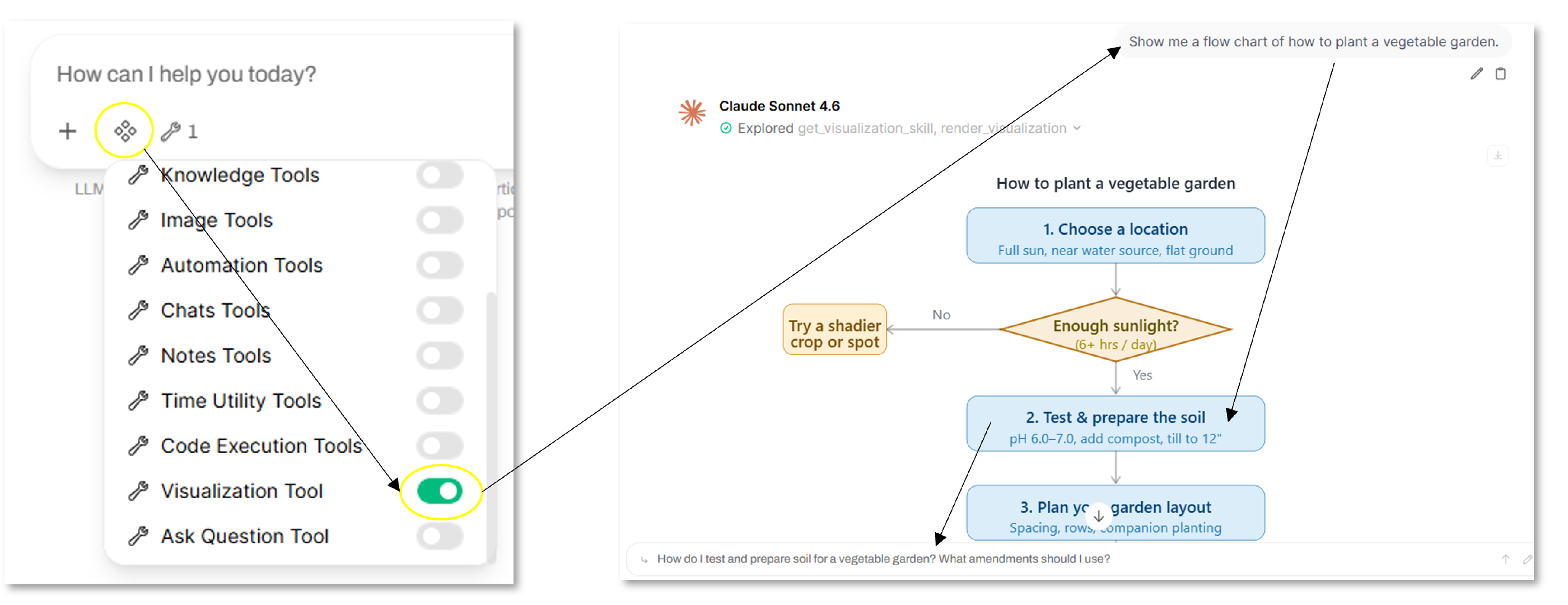
You can click on any of the boxes generated to dig down further, as a related prompt will be auto-generated from the response.
Example #2 - Build a Dashboard from an Existing Dataset
In the following example, we will build an interactive dashboard using an available dataset in CSV format. First, upload your CSV data file to your model. Then select both the Visualization and Code Execution tools, and enter your prompt (e.g., “Build a simple dashboard for this dataset”).
The Code Execution tool allows the model to first create a program and compile the data into a usable format before rendering the result. This forces the model to understand the data before rendering a visualization, resulting in a more accurate result. Further, this is much more efficient than having the model review and compute data in real time, resulting in fewer used tokens.
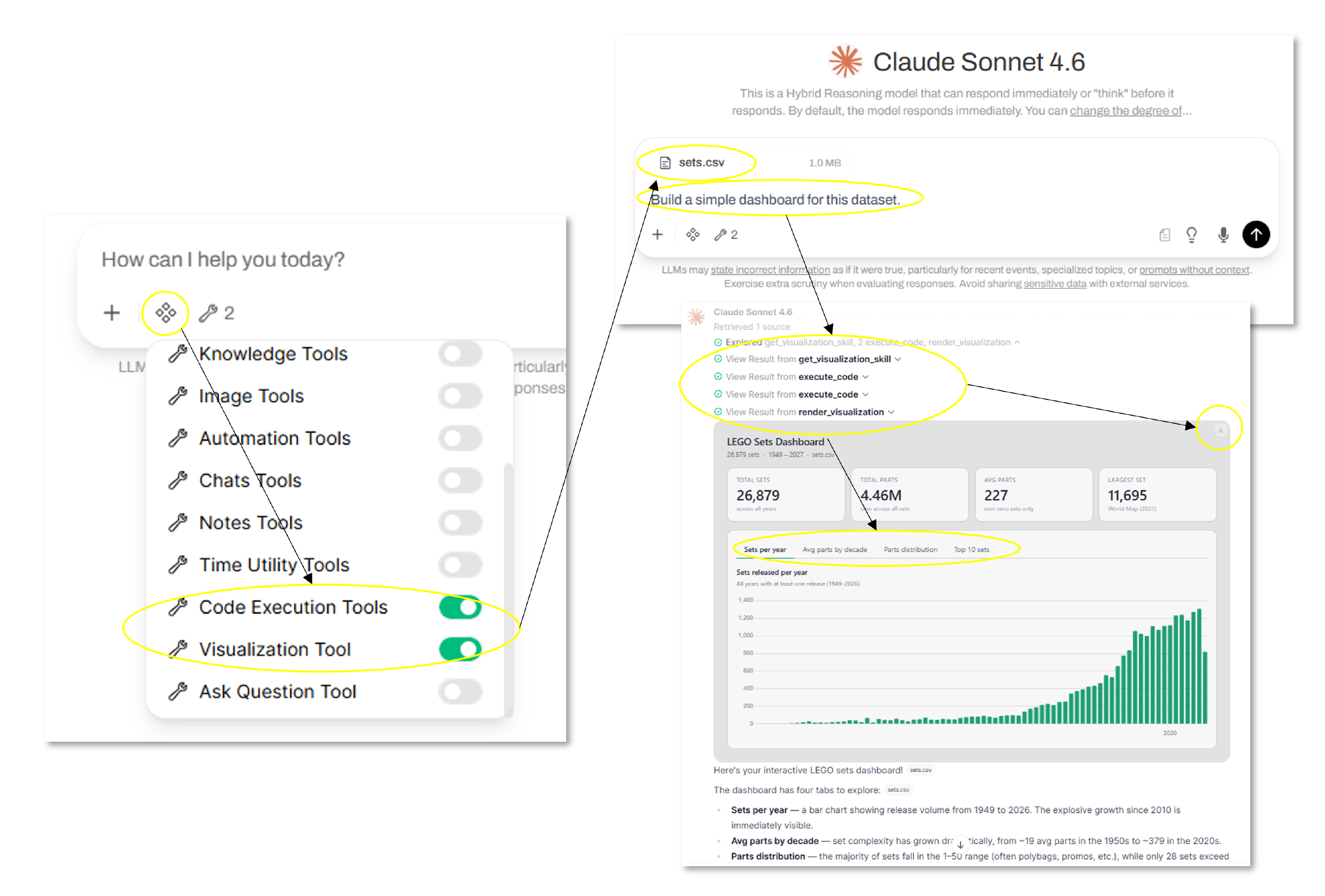
The output is an interactive dashboard with charts showing the data from multiple perspectives. The dashboard can also be downloaded to HTML and used outside the Dartmouth Chat interface.
Didn’t find what you needed? Please reach out to research.computing@dartmouth.edu .